Kibun

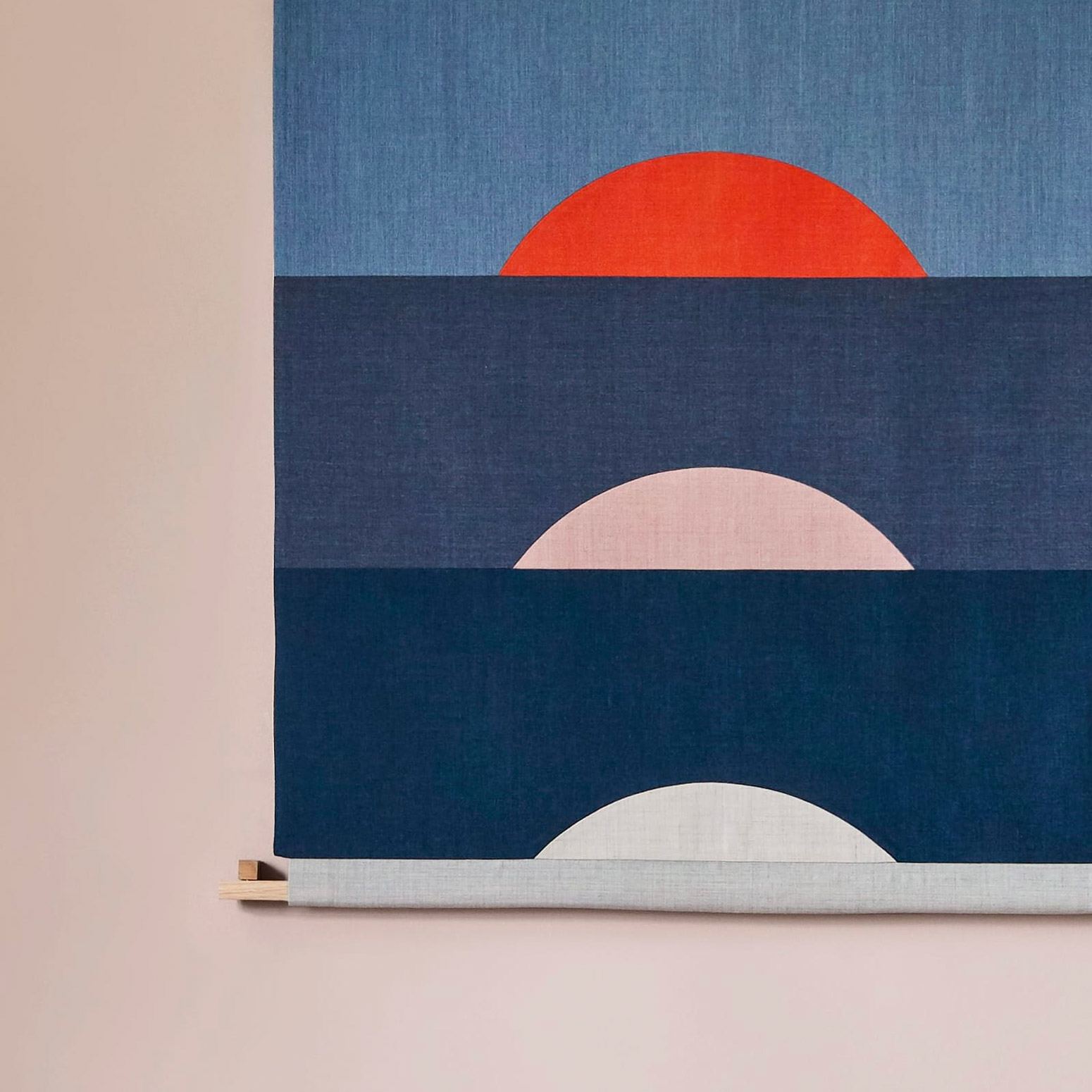
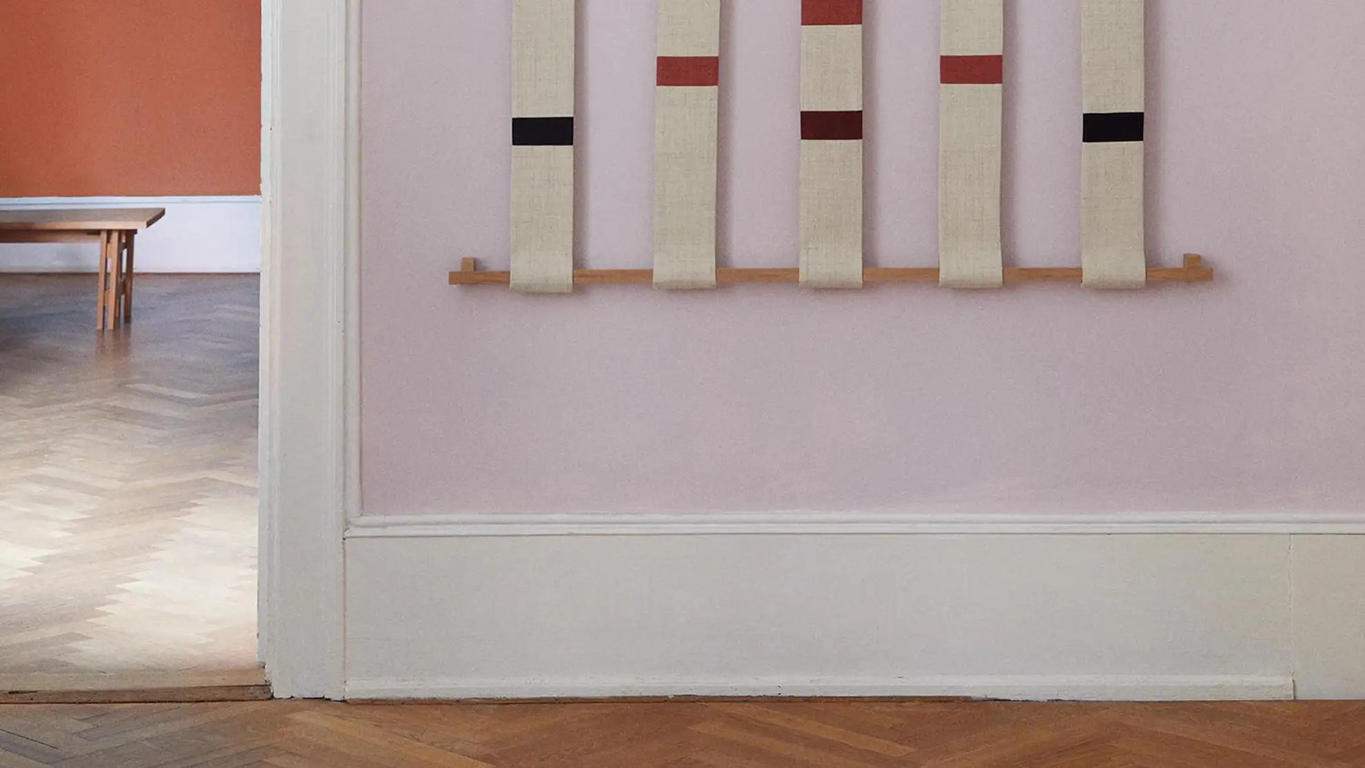
A picture from the new webshop of the textile piece called Rain hanging on a wall in a light room.
Client
Hvass&Hannibal
Type
Webshop
Services
Website
E-commerce
User experience
Interaction design
Recognitions
eCommerce of the Year Nominee – Awwards

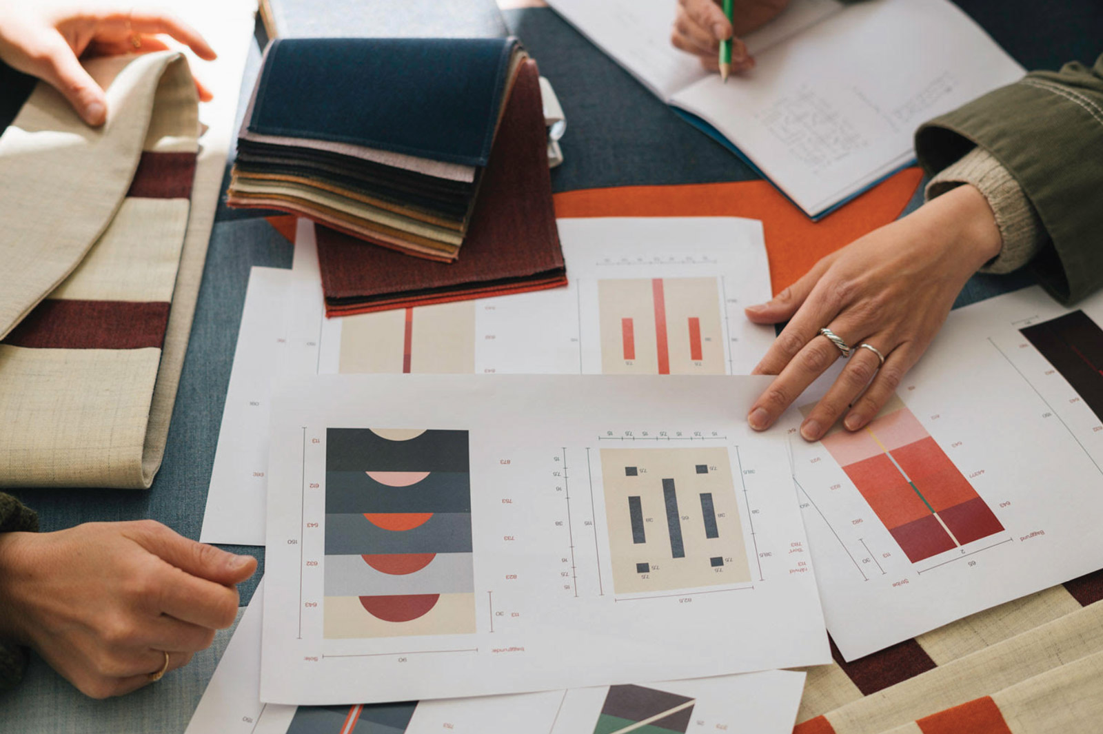
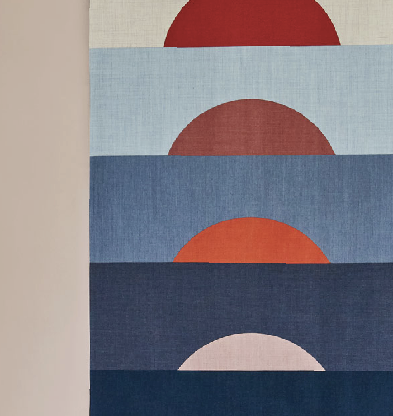
Kibun is Japanese for mood – and the name of the latest passion project by the Danish illustration and artist duo Hvass&Hannibal. Exploring how simple a story can be told, the result is a limited edition of textile panels that each expresses a scenery we know from nature: The slow setting of the sun, pouring rain, or tide coming in.

We helped Nan Na Hvass and Sofie Hannibal present their work on a website that mirrors nature's fluctuating movements. The result is an e-commerce-focused site that invites the audience to engage with the one-of-a-kind art pieces.

The navigation used on the Kibun webshop
Showing products presentation on the Kibun webshop
The Gallery Experience
Just as you would move, were the panels hung next to each other in a gallery, the website provides a horizontal scrolling experience on desktop. With the cart and menu always present in respectively the right and left corner, the experience combines the elegance of a gallery with the dynamic of modern e-commerce.
A video of the Kibun webshop
The Gallery Experience
Just as you would move, were the panels hung next to each other in a gallery, the website provides a horizontal scrolling experience on desktop. With the cart and menu always present in respectively the right and left corner, the experience combines the elegance of a gallery with the dynamic of modern e-commerce.
A video of the Kibun webshop
The Gallery Experience
Just as you would move, were the panels hung next to each other in a gallery, the website provides a horizontal scrolling experience on desktop. With the cart and menu always present in respectively the right and left corner, the experience combines the elegance of a gallery with the dynamic of modern e-commerce.
The Gallery Experience
Just as you would move, were the panels hung next to each other in a gallery, the website provides a horizontal scrolling experience on desktop. With the cart and menu always present in respectively the right and left corner, the experience combines the elegance of a gallery with the dynamic of modern e-commerce.
A video of the Kibun webshop
The Gallery Experience
Just as you would move, were the panels hung next to each other in a gallery, the website provides a horizontal scrolling experience on desktop. With the cart and menu always present in respectively the right and left corner, the experience combines the elegance of a gallery with the dynamic of modern e-commerce.
The Gallery Experience
Just as you would move, were the panels hung next to each other in a gallery, the website provides a horizontal scrolling experience on desktop. With the cart and menu always present in respectively the right and left corner, the experience combines the elegance of a gallery with the dynamic of modern e-commerce.
A video of the Kibun webshop
The Gallery Experience
Just as you would move, were the panels hung next to each other in a gallery, the website provides a horizontal scrolling experience on desktop. With the cart and menu always present in respectively the right and left corner, the experience combines the elegance of a gallery with the dynamic of modern e-commerce.
The Gallery Experience
Just as you would move, were the panels hung next to each other in a gallery, the website provides a horizontal scrolling experience on desktop. With the cart and menu always present in respectively the right and left corner, the experience combines the elegance of a gallery with the dynamic of modern e-commerce.
A video of the Kibun webshop
The Gallery Experience
Just as you would move, were the panels hung next to each other in a gallery, the website provides a horizontal scrolling experience on desktop. With the cart and menu always present in respectively the right and left corner, the experience combines the elegance of a gallery with the dynamic of modern e-commerce.
The Gallery Experience
Just as you would move, were the panels hung next to each other in a gallery, the website provides a horizontal scrolling experience on desktop. With the cart and menu always present in respectively the right and left corner, the experience combines the elegance of a gallery with the dynamic of modern e-commerce.
A product description from the Kibun webshop
A Blank Canvas
As the Hannibal&Hvass portfolio site, the Kibun webshop is held in neutral and light colors to make the vivid colors of their work stand out. By alternating between serif and sans serif, the typography supports the feeling of the website: Light and dynamic and a subtle hint of playfulness.
Showing of the product page from the Kibun webshop
A Blank Canvas
As the Hannibal&Hvass portfolio site, the Kibun webshop is held in neutral and light colors to make the vivid colors of their work stand out. By alternating between serif and sans serif, the typography supports the feeling of the website: Light and dynamic and a subtle hint of playfulness.
Showing of the product page from the Kibun webshop
A Blank Canvas
As the Hannibal&Hvass portfolio site, the Kibun webshop is held in neutral and light colors to make the vivid colors of their work stand out. By alternating between serif and sans serif, the typography supports the feeling of the website: Light and dynamic and a subtle hint of playfulness.
A Blank Canvas
As the Hannibal&Hvass portfolio site, the Kibun webshop is held in neutral and light colors to make the vivid colors of their work stand out. By alternating between serif and sans serif, the typography supports the feeling of the website: Light and dynamic and a subtle hint of playfulness.
Showing of the product page from the Kibun webshop
A Blank Canvas
As the Hannibal&Hvass portfolio site, the Kibun webshop is held in neutral and light colors to make the vivid colors of their work stand out. By alternating between serif and sans serif, the typography supports the feeling of the website: Light and dynamic and a subtle hint of playfulness.
A Blank Canvas
As the Hannibal&Hvass portfolio site, the Kibun webshop is held in neutral and light colors to make the vivid colors of their work stand out. By alternating between serif and sans serif, the typography supports the feeling of the website: Light and dynamic and a subtle hint of playfulness.
Bespoke Product Views
We designed the Kibun webshop in Webflow, which lets us customise every detail to match the overall brand feeling. On each product page, the individual product images are stacked, making it feel more like flipping through the pages of a catalogue and less like simply clicking with the mouse.
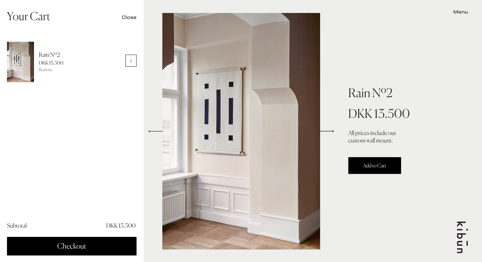
A screenshot of the screenshot of the Kibun webshop
Bespoke Product Views
We designed the Kibun webshop in Webflow, which lets us customise every detail to match the overall brand feeling. On each product page, the individual product images are stacked, making it feel more like flipping through the pages of a catalogue and less like simply clicking with the mouse.
A screenshot of the screenshot of the Kibun webshop
Bespoke Product Views
We designed the Kibun webshop in Webflow, which lets us customise every detail to match the overall brand feeling. On each product page, the individual product images are stacked, making it feel more like flipping through the pages of a catalogue and less like simply clicking with the mouse.
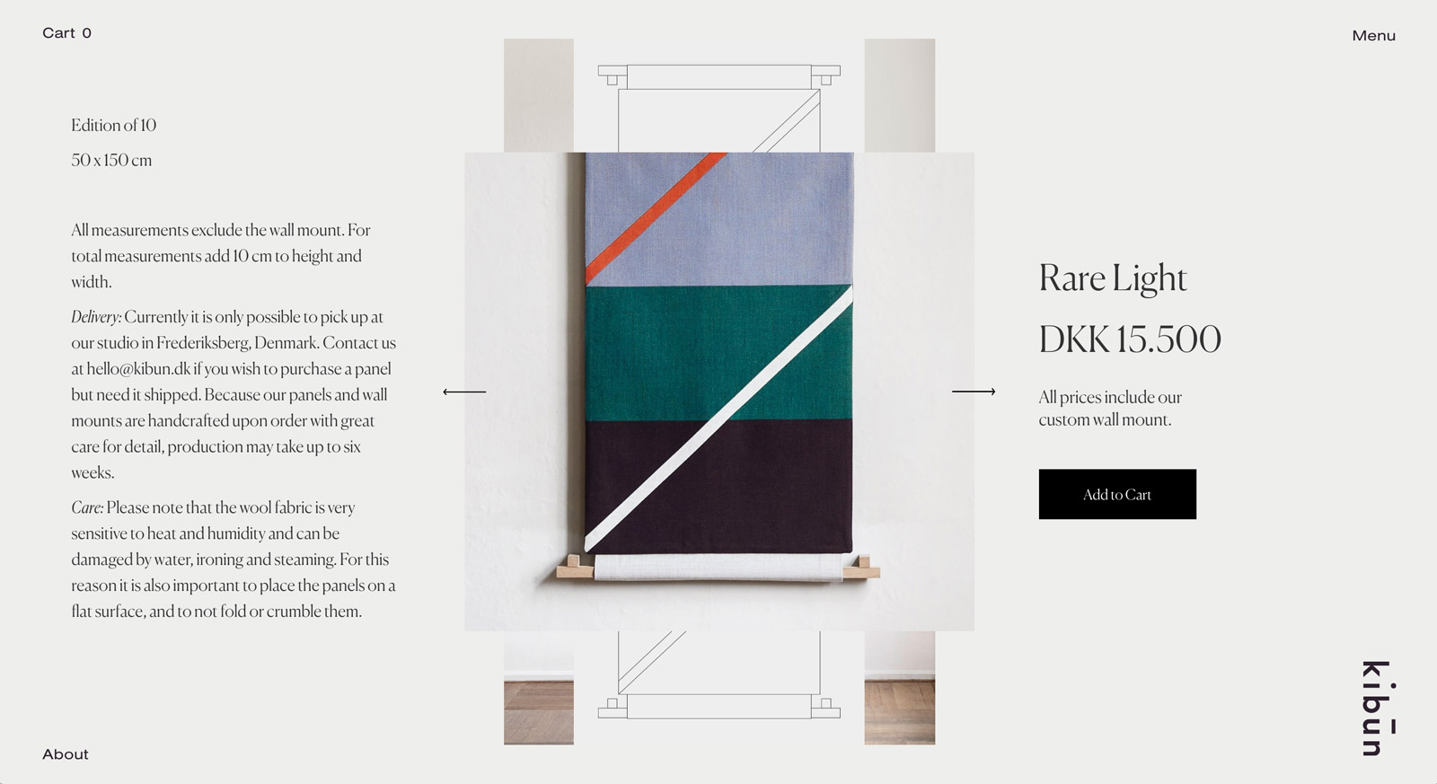
Bespoke Product Views
We designed the Kibun webshop in Webflow, which lets us customise every detail to match the overall brand feeling. On each product page, the individual product images are stacked, making it feel more like flipping through the pages of a catalogue and less like simply clicking with the mouse.
A screenshot of the screenshot of the Kibun webshop
Bespoke Product Views
We designed the Kibun webshop in Webflow, which lets us customise every detail to match the overall brand feeling. On each product page, the individual product images are stacked, making it feel more like flipping through the pages of a catalogue and less like simply clicking with the mouse.
Bespoke Product Views
We designed the Kibun webshop in Webflow, which lets us customise every detail to match the overall brand feeling. On each product page, the individual product images are stacked, making it feel more like flipping through the pages of a catalogue and less like simply clicking with the mouse.
A screenshot of the screenshot of the Kibun webshop
Bespoke Product Views
We designed the Kibun webshop in Webflow, which lets us customise every detail to match the overall brand feeling. On each product page, the individual product images are stacked, making it feel more like flipping through the pages of a catalogue and less like simply clicking with the mouse.
Bespoke Product Views
We designed the Kibun webshop in Webflow, which lets us customise every detail to match the overall brand feeling. On each product page, the individual product images are stacked, making it feel more like flipping through the pages of a catalogue and less like simply clicking with the mouse.
A screenshot of the screenshot of the Kibun webshop
Bespoke Product Views
We designed the Kibun webshop in Webflow, which lets us customise every detail to match the overall brand feeling. On each product page, the individual product images are stacked, making it feel more like flipping through the pages of a catalogue and less like simply clicking with the mouse.
Bespoke Product Views
We designed the Kibun webshop in Webflow, which lets us customise every detail to match the overall brand feeling. On each product page, the individual product images are stacked, making it feel more like flipping through the pages of a catalogue and less like simply clicking with the mouse.
No items found.

Care to see more?

Here are a few more cases for you to explore.
Danish Film Academy
Graphic design
Strategy
Website
Bringing Missions to Life
Website
Webflow
Campaigns
User experience
Visual identity
Genius + Poison
Art direction
Visual identity
Website
Webflow