Viewport

Client
Viewport
Type
Services
Website
Visual identity
Design system
Typography
Logo
Webflow
Recognitions
No items found.

Granyon undertook the task of crafting a distinctive brand and website for Viewport, an innovative company based in Atlanta, USA, specializing in delivering large-scale, engaged audiences across diverse media channels. Viewport empowers businesses to achieve their campaign objectives transparently, with precision and relevance to their target audience.

Our creative approach involved conceptualizing a brand identity and website that displays the fluidity of screen sizes, mirroring the contemporary essence of Viewport's omnipresent cross-screen solutions.

The Viewport frames
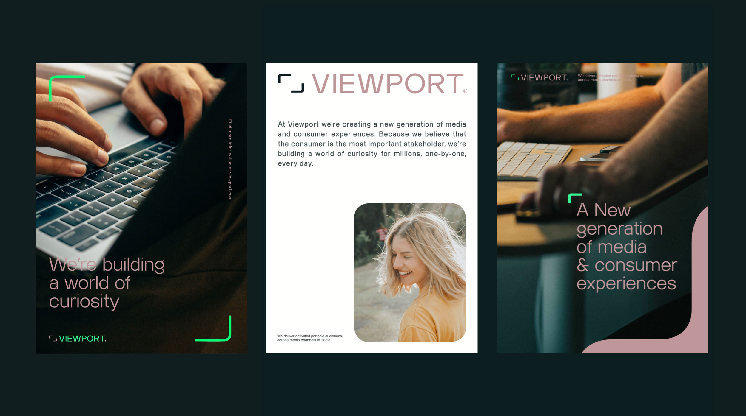
The viewport icon reminds of the director hand frames sign, and at the same time the curvature of the viewport sign is also based on the Almarena Display curves. The viewport sign allows to display content in a playful way, and the shapes is a common thread through the different CVI elements like the graphics, the rounded corners and viewport frames. Color-wise we have been working with a dark tech universe combined with a very vivid neon green to makes things pop.
The new, dynamic website
Our goal for the new Viewport website was to ensure it resonated with the brand identity and effectively conveyed the company's core essence. To achieve this, we implemented subtle parallax animations, integrated live infographics with captivating visual effects, and seamlessly merged images with video elements. This approach imbued the website with a dynamic and trustworthy ambiance, aligning with Viewport's unique character.
"Please send a thank you to your team. I think the site and especially the brand is fantastic."
Micah Canal, Head of Marketing
No items found.

Care to see more?

Here are a few more cases for you to explore.
Rumsans
Graphic design
Logo
Strategy
Social media
Website
Pusha T featuring Ms. Lauryn Hill
Art direction
Webflow
Website
Content creation
EURODOC
Logo
Webflow
Website