Aurélia Durand

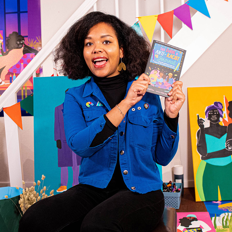
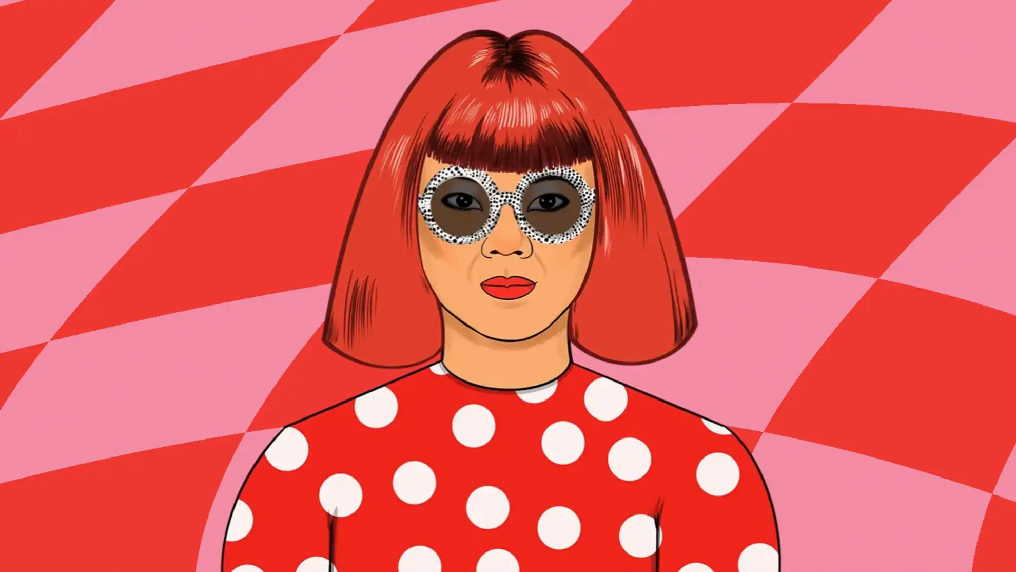
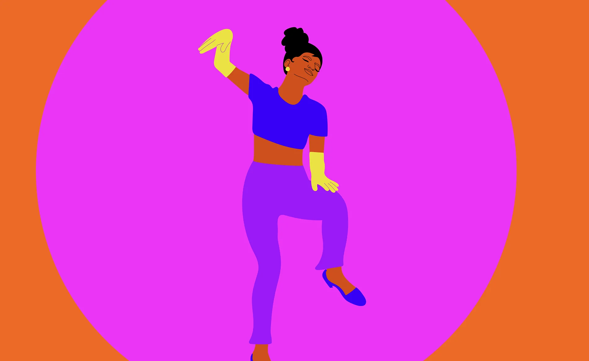
Colorful illustrations of different characters made by Aurélia Studio.
Client
Aurélia Durand
Type
Website
Services
Website
User experience
Interaction design
Recognitions
Site of the Day - Awwwards
Developer Award - Awwwards
Webby Awards
Webby Awards
Shortlist - Creative Circle
Gold Lovie, The Lovie Awards
People's Lovie, The Lovie Awards
Interactive Annual, Communication Arts

Aurélia Durand is a young illustrator based in Copenhagen. Through vivid colors, powerful statements, and sassy playfulness, she aims to celebrate her afro-descendants and empower people to believe in themselves. Making her art come alive on a website has been a translation task. But by zooming in on or magnifying details and making her characters dance around on the pages, we've created a universe that can't help but make its visitors smile. And that's what Aurélia Durand is all about.
Layered Layout

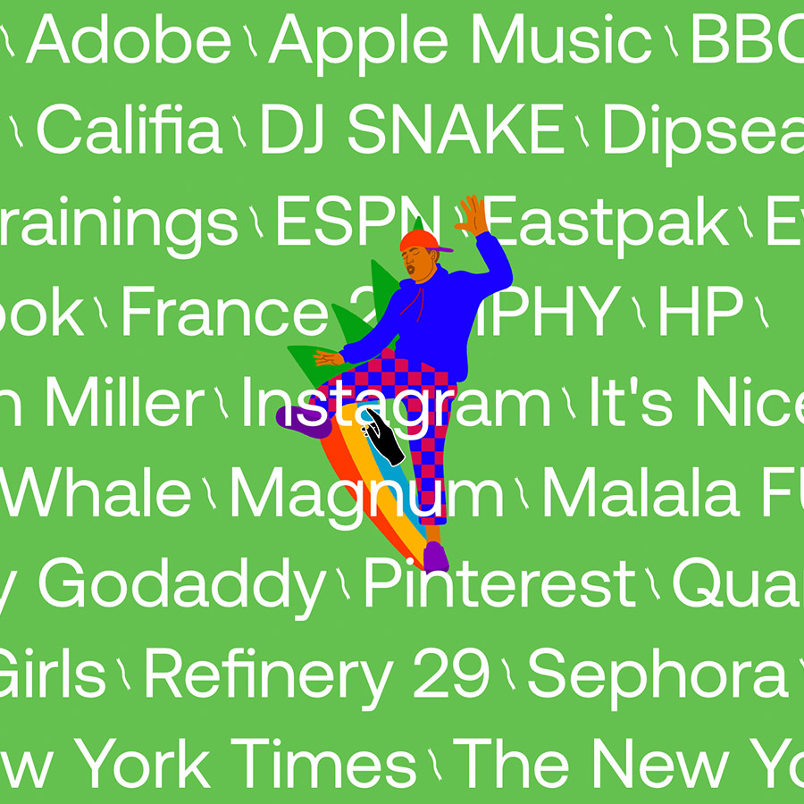
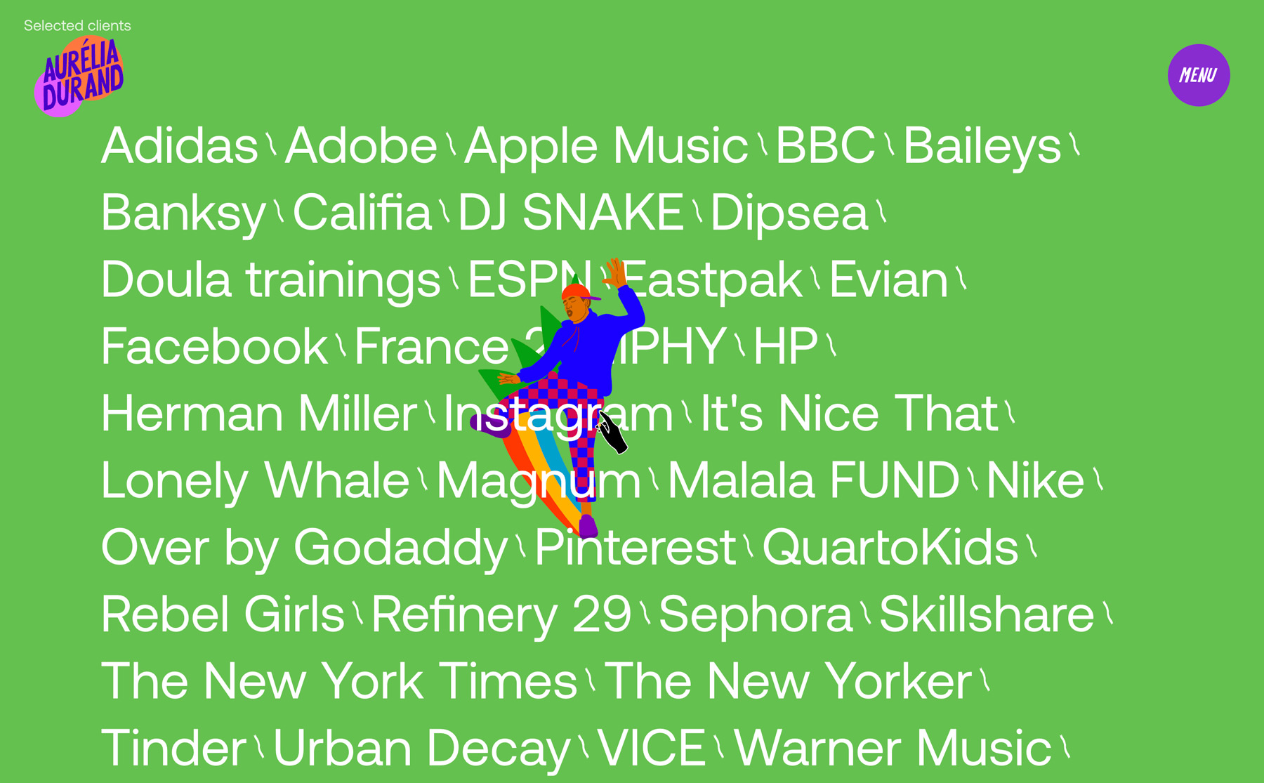
As Aurélia does in her work, we've worked with layers on the website that moves individually as you move around the website. At the top deck, you will notice this immediately, with three different cases showing. The common denominator is the circle in the background with subtle movements that act as a backdrop for the illustration in the middle and the foreground title. We applied the same effect in the menu where her feisty ladies appear when you hover over the different options.

Layered Layout
Layered Layout

As Aurélia does in her work, we've worked with layers on the website that moves individually as you move around the website. At the top deck, you will notice this immediately, with three different cases showing. The common denominator is the circle in the background with subtle movements that act as a backdrop for the illustration in the middle and the foreground title. We applied the same effect in the menu where her feisty ladies appear when you hover over the different options.

Layered Layout

As Aurélia does in her work, we've worked with layers on the website that moves individually as you move around the website. At the top deck, you will notice this immediately, with three different cases showing. The common denominator is the circle in the background with subtle movements that act as a backdrop for the illustration in the middle and the foreground title. We applied the same effect in the menu where her feisty ladies appear when you hover over the different options.

Layered Layout
Layered Layout
Layered Layout
Layered Layout
Layered Layout
Layered Layout

As Aurélia does in her work, we've worked with layers on the website that moves individually as you move around the website. At the top deck, you will notice this immediately, with three different cases showing. The common denominator is the circle in the background with subtle movements that act as a backdrop for the illustration in the middle and the foreground title. We applied the same effect in the menu where her feisty ladies appear when you hover over the different options.

Layered Layout

As Aurélia does in her work, we've worked with layers on the website that moves individually as you move around the website. At the top deck, you will notice this immediately, with three different cases showing. The common denominator is the circle in the background with subtle movements that act as a backdrop for the illustration in the middle and the foreground title. We applied the same effect in the menu where her feisty ladies appear when you hover over the different options.

Layered Layout

As Aurélia does in her work, we've worked with layers on the website that moves individually as you move around the website. At the top deck, you will notice this immediately, with three different cases showing. The common denominator is the circle in the background with subtle movements that act as a backdrop for the illustration in the middle and the foreground title. We applied the same effect in the menu where her feisty ladies appear when you hover over the different options.

Layered Layout

As Aurélia does in her work, we've worked with layers on the website that moves individually as you move around the website. At the top deck, you will notice this immediately, with three different cases showing. The common denominator is the circle in the background with subtle movements that act as a backdrop for the illustration in the middle and the foreground title. We applied the same effect in the menu where her feisty ladies appear when you hover over the different options.

Layered Layout
Layered Layout
Filtered Explore Page

To make Aurélia's extensive portfolio of personal and commissioned work available and fun to engage with, we've created a keyword filter on the "Explore" page. This allows you to enter any word you can think of – from party to poetry. The search shows live results, so you can see what appears as you type.

Filtered Explore Page
Custom font and cursor 
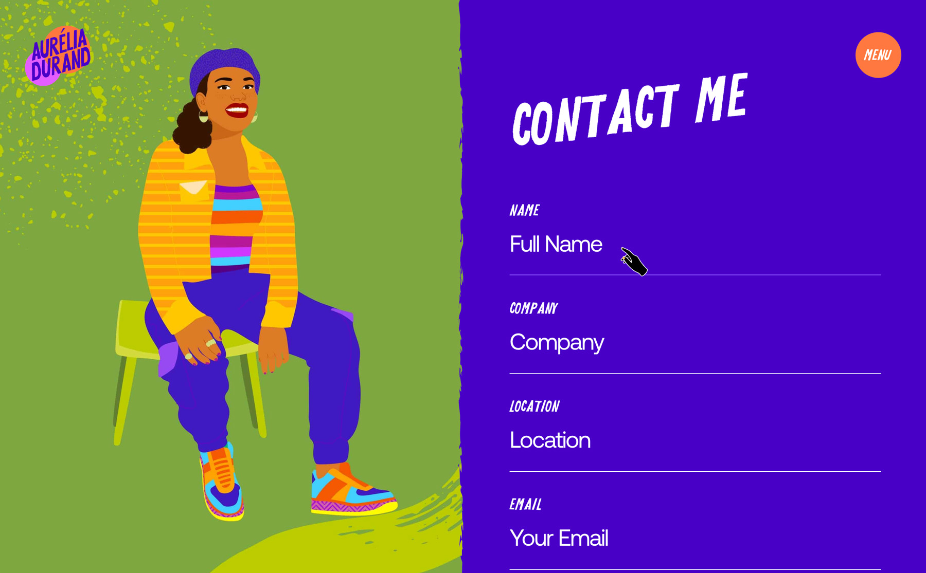
Aurélia has designed her own custom font, which she uses for statements in the illustrations. Combined with a more classic sans serif font, all texts are quite literally written in her own words and letters. Making every pixel feel and move like her, she's also created a custom cursor. 
Transition effects and sections 
The website is designed to make you want to move around the page – if not looking for something concrete, simply to see what happens. So with every interaction, we've worked with smaller and big effects. The most significant of those is the page transition – a wavy movement that origins in one of her animated videos.
Aurélia Durand

Care to see more?

Here are a few more cases for you to explore.
FED UP by Sharanda Jones
Interaction design
Webflow
Website
Visual identity
WebGL
AQRisk
Visual identity
Webflow
Website
WebGL
Jay Siegan Presents – Brand & Web
Visual identity
Core story
Graphic design
Logo
Print