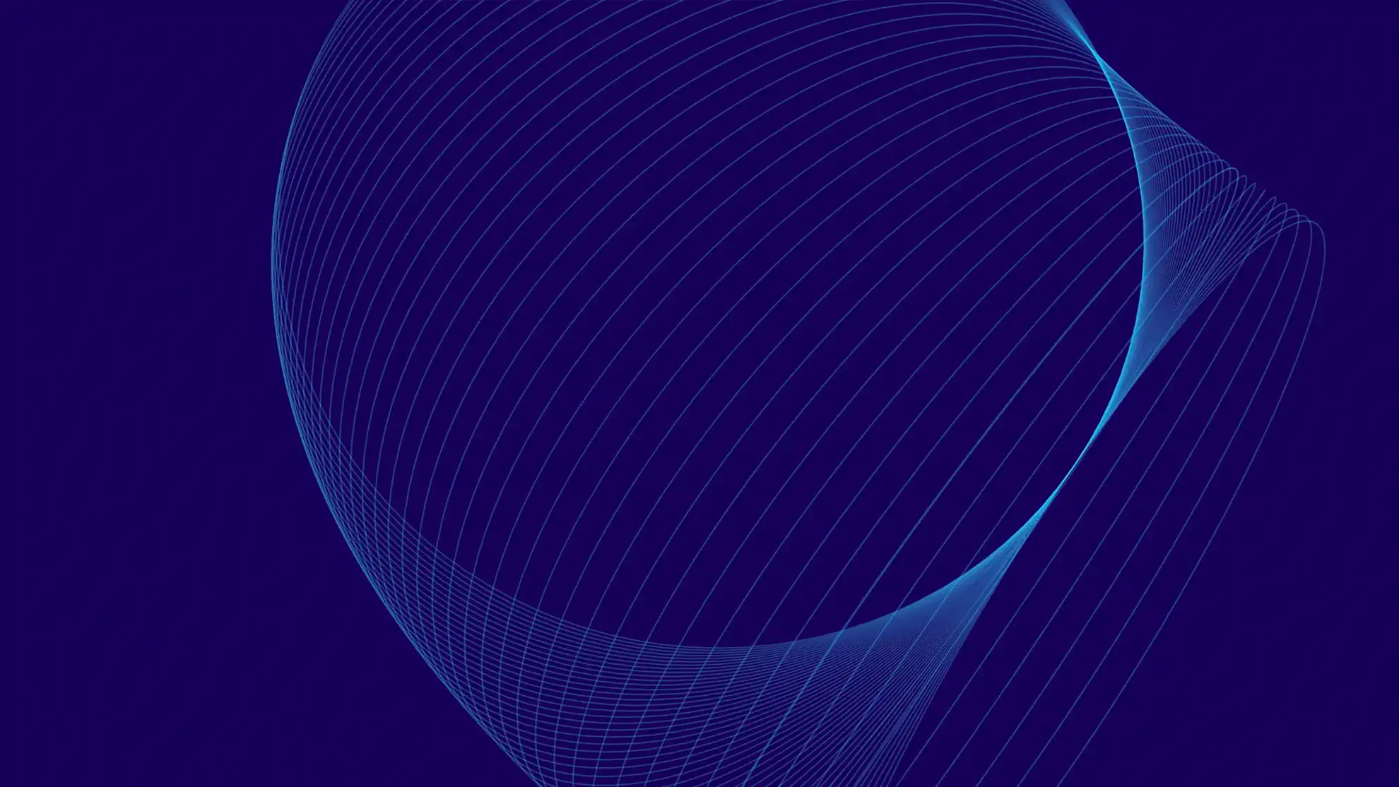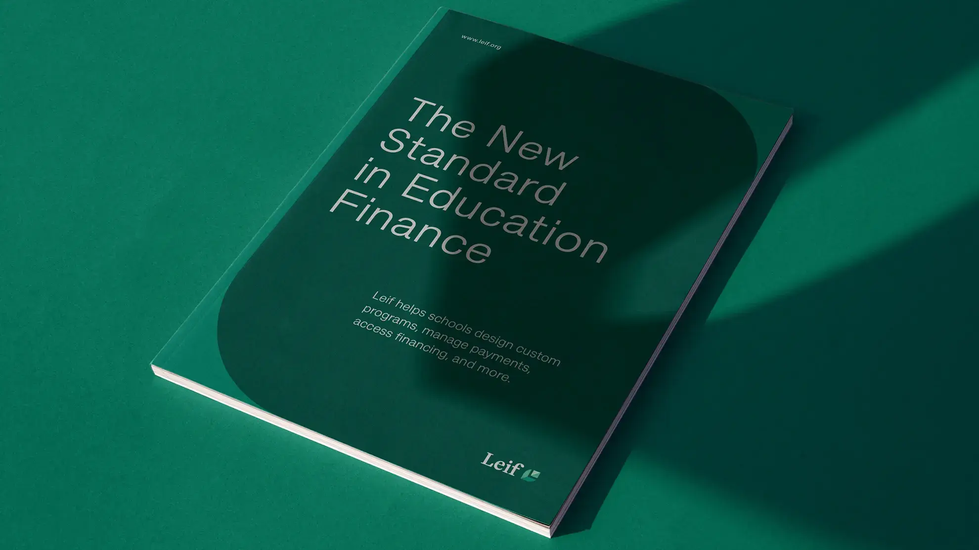
Ascen Brand & Website
Ascen is a modern back office platform and employer of record for staffing firms. They are here to help staffing companies of any size at any stage.
Their team successfully sold a previous business and then launched a tech-enabled staffing company.
Ascen realized the hardest part about getting the company off the ground was compliance in 50 states plus payroll funding.
Soon Ascen is launching an API for larger companies to integrate their back office and then a pure software version of their pay and bill platform for larger staffing agencies to run their payroll through our platform. Granyon helped revamp its brand identity and designed and developed the new website using Webflow.


TT Hoves
The concept behind TT Hoves was to craft a Scandinavian sans serif font, which eventually took shape as TT Hoves and joined the TypeType collection in 2018. The aim was to achieve simplicity, recognizability, and originality in the new typeface. The name TT Hoves derives from "horizontals" and "verticals," highlighting the prominence of these elements in its design. TT Hoves is characterized by a subtle absence of contrast, resulting in a sleek, contemporary, and highly legible typeface.
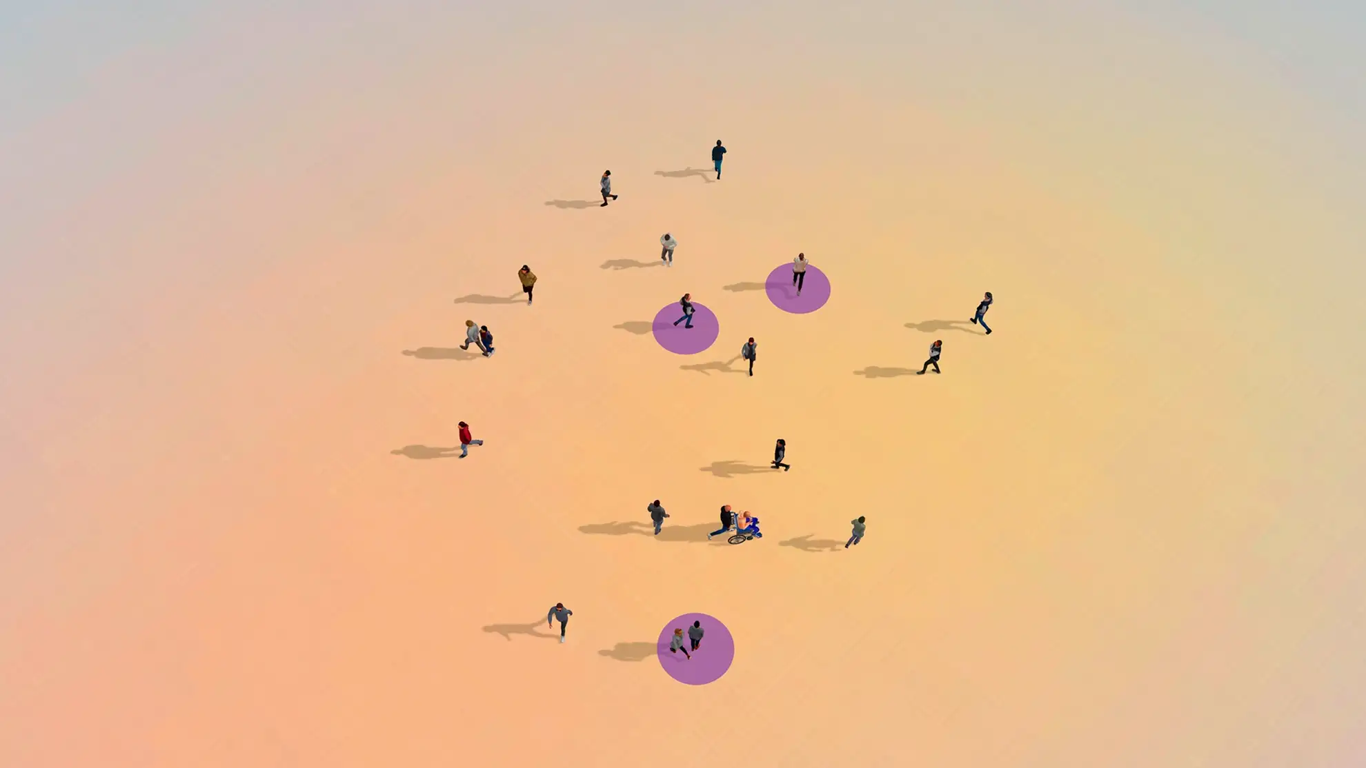
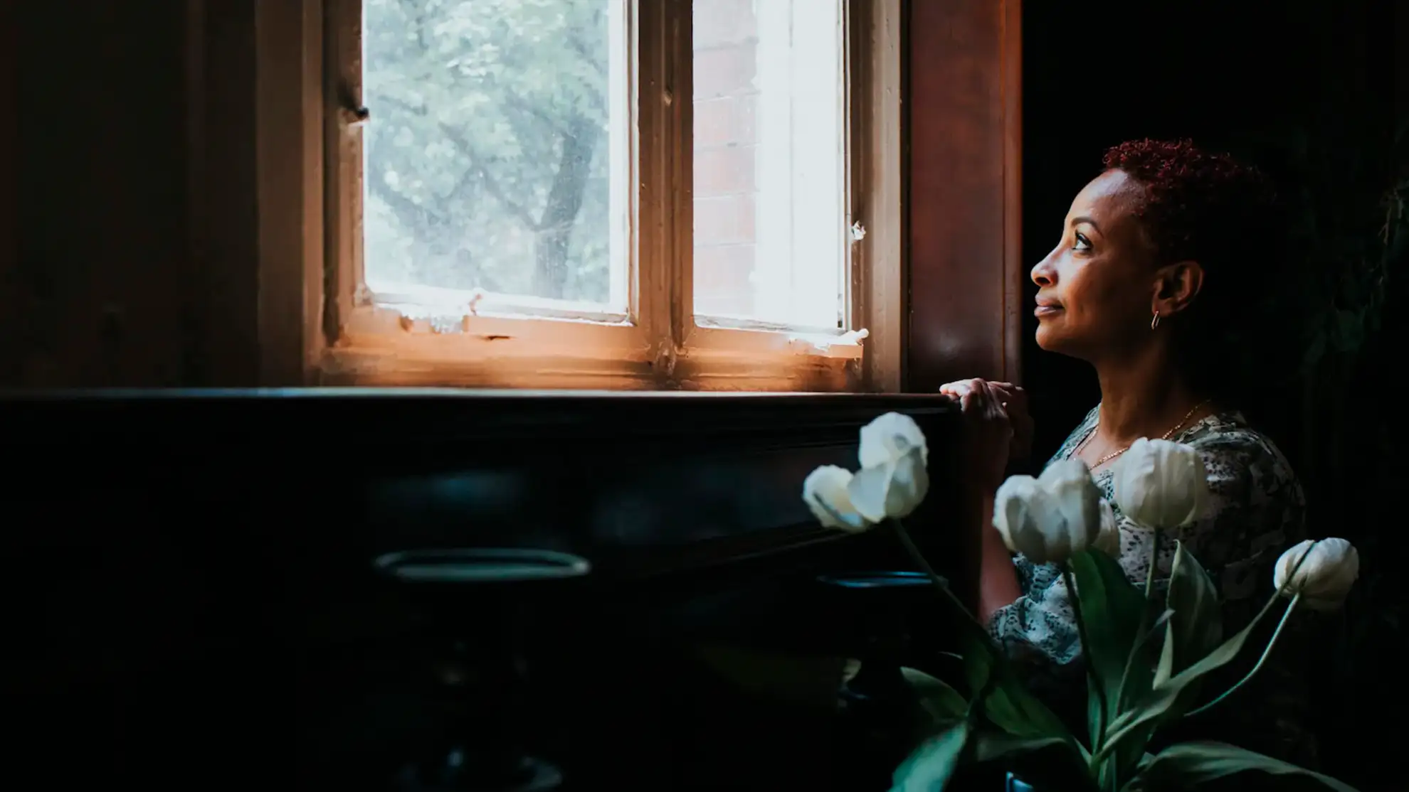
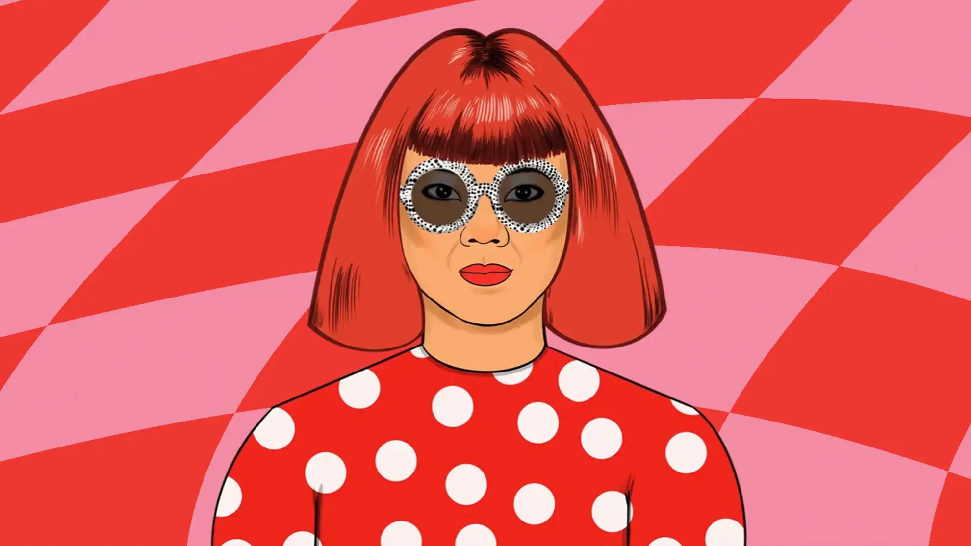
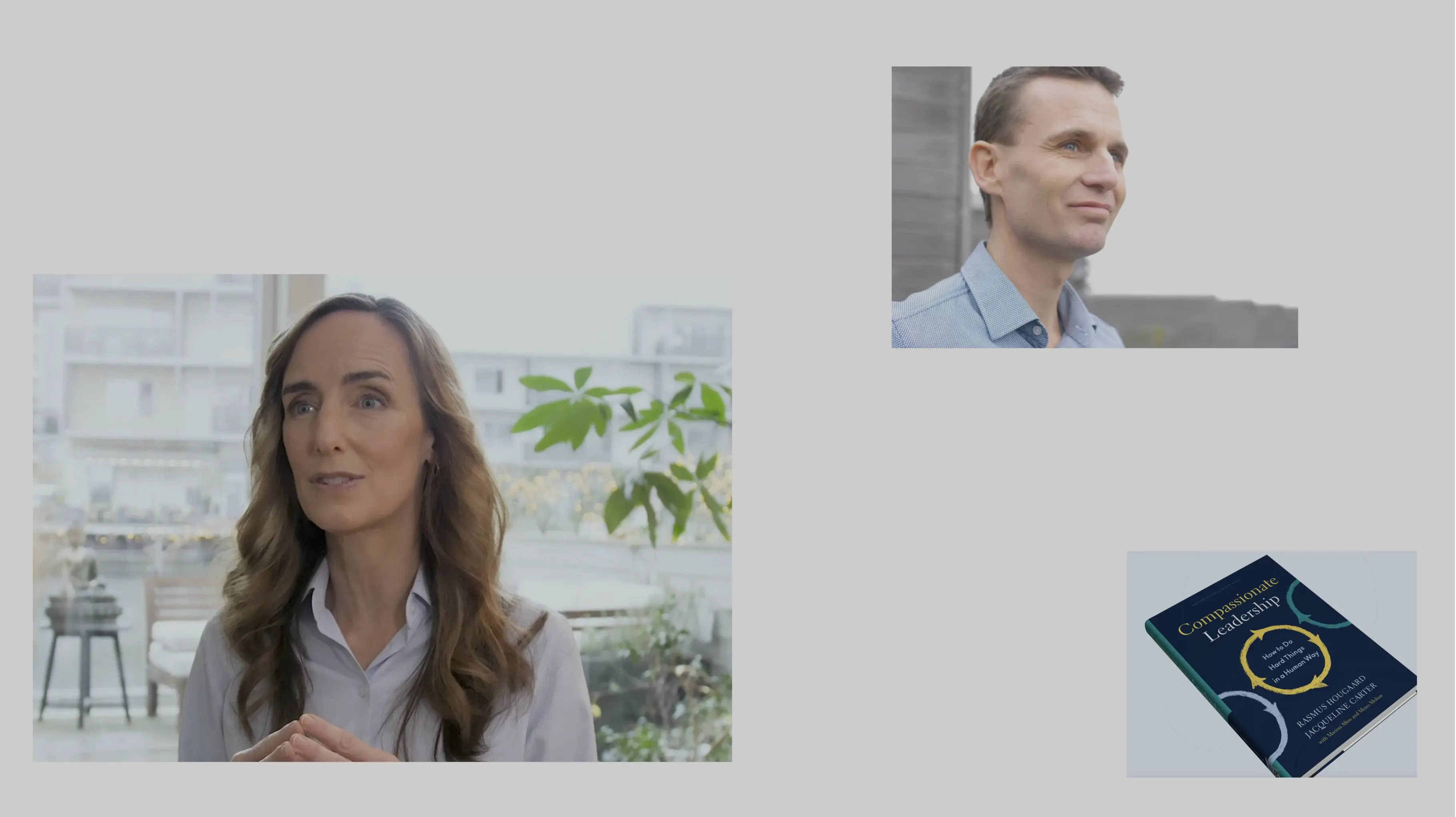
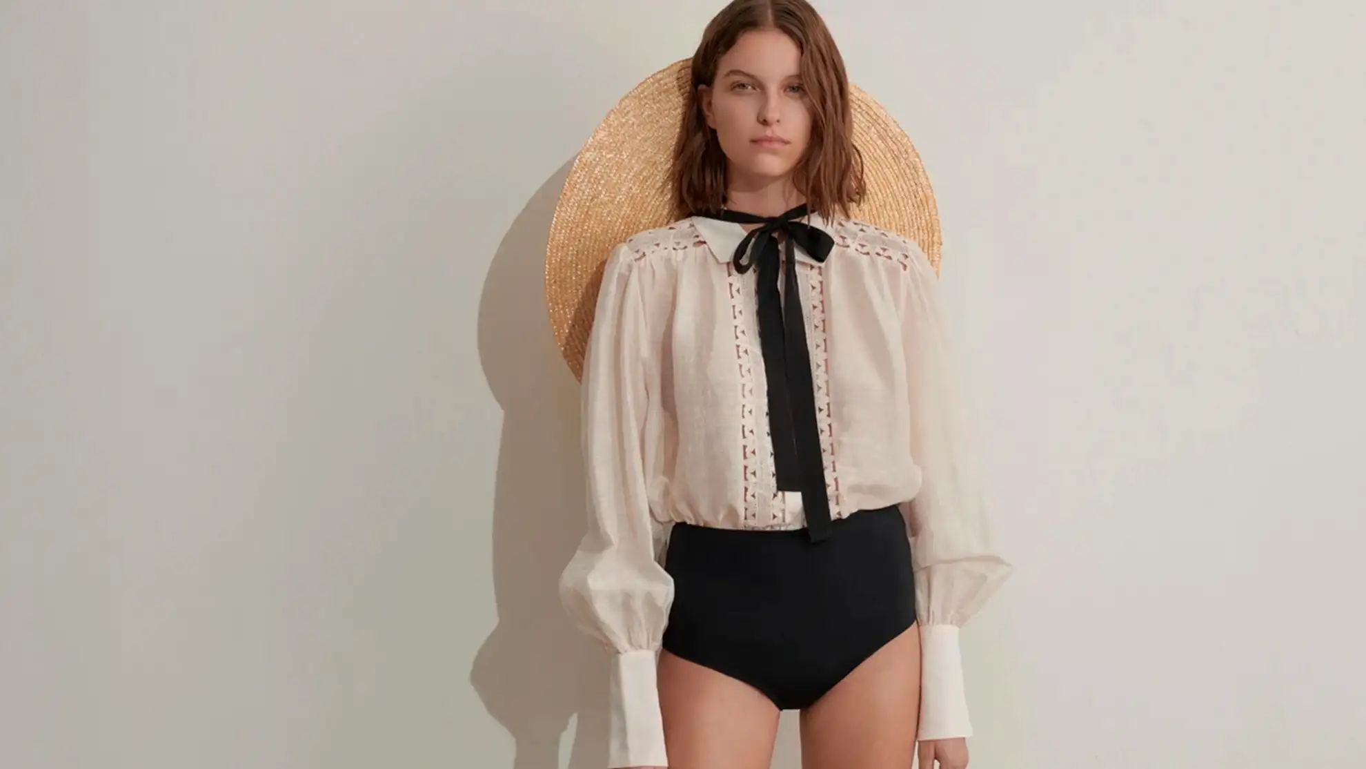
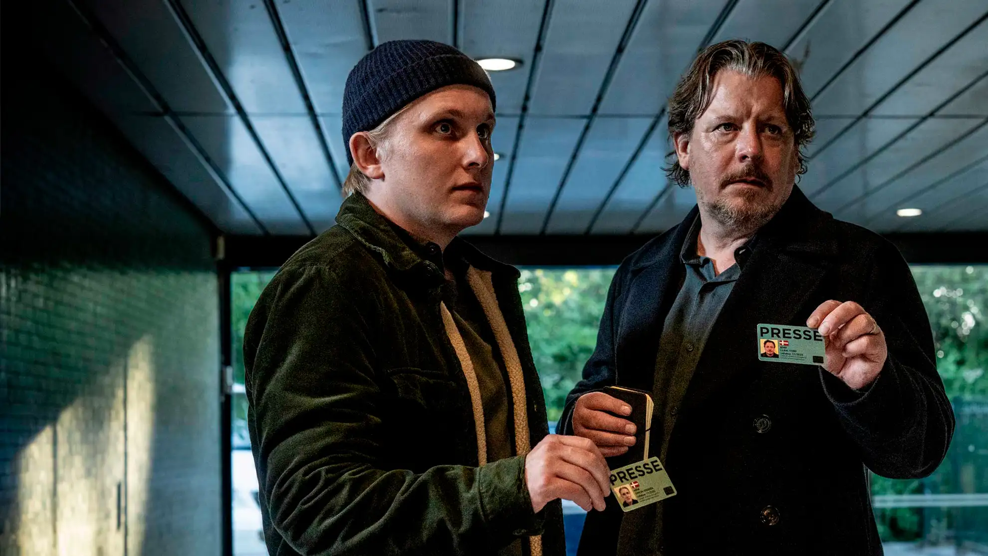
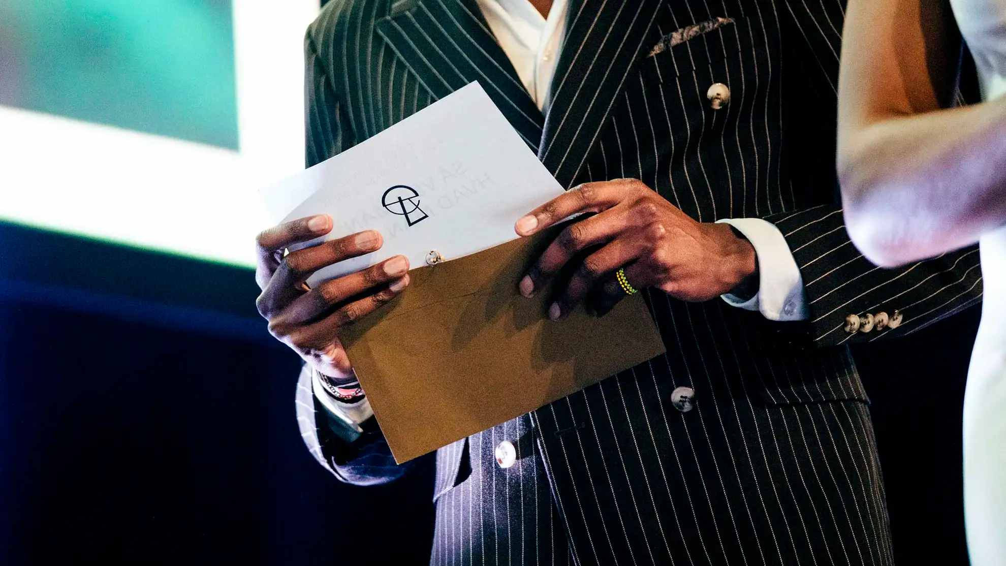
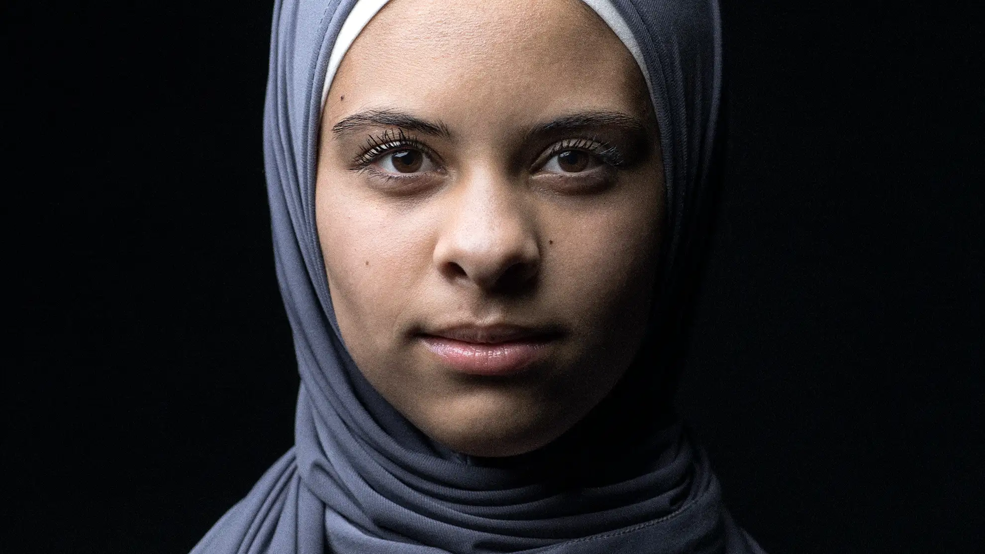
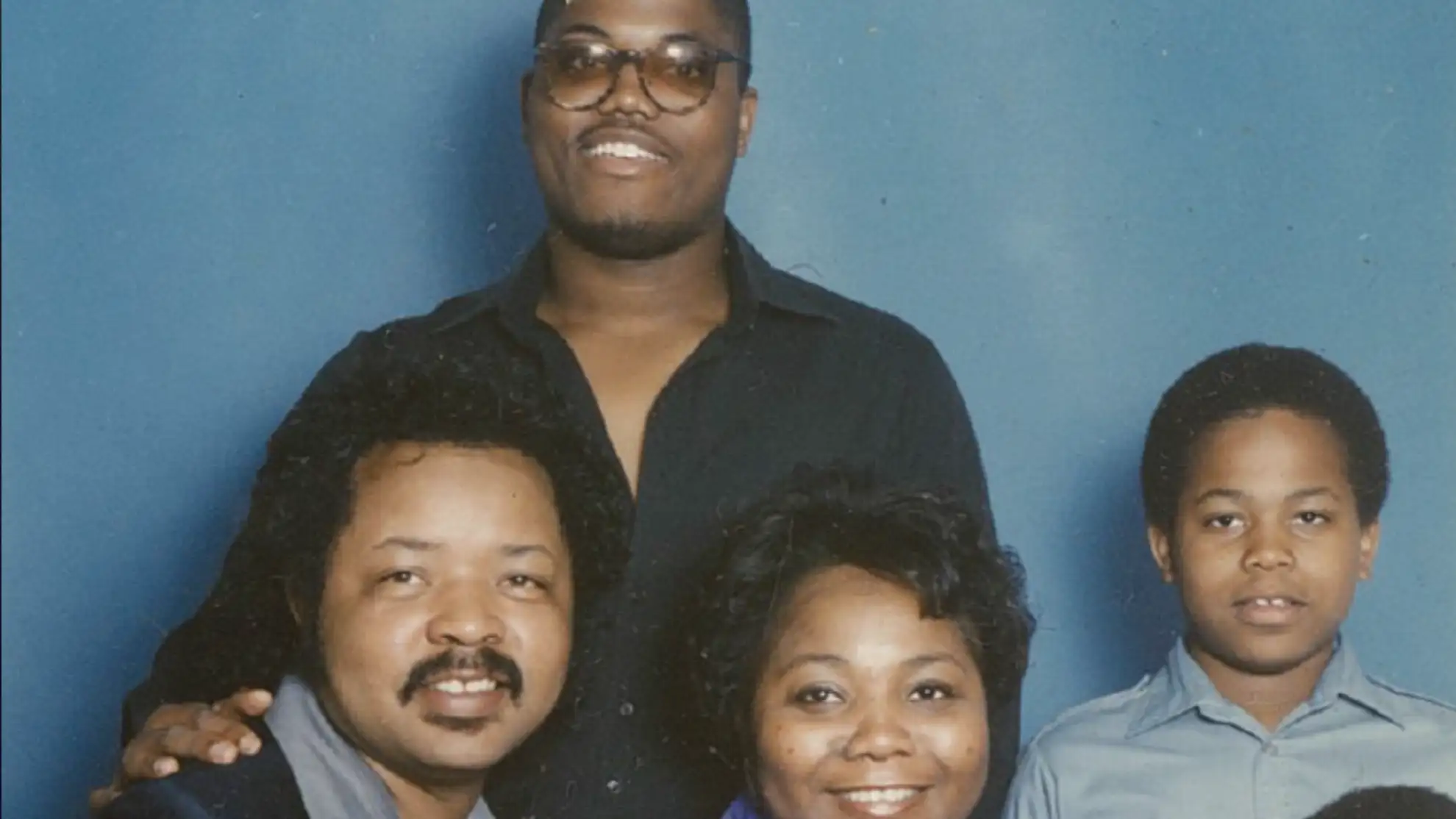
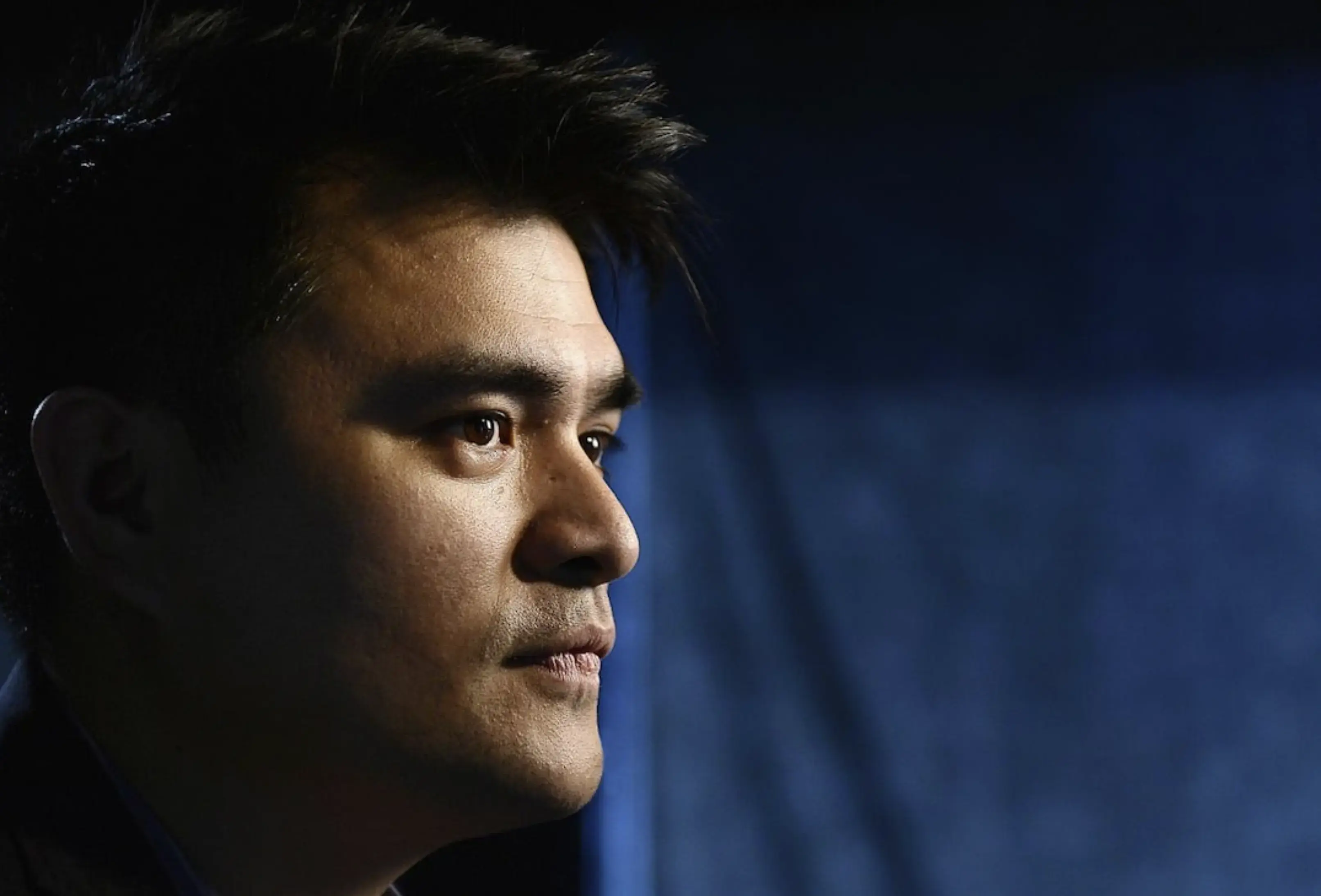
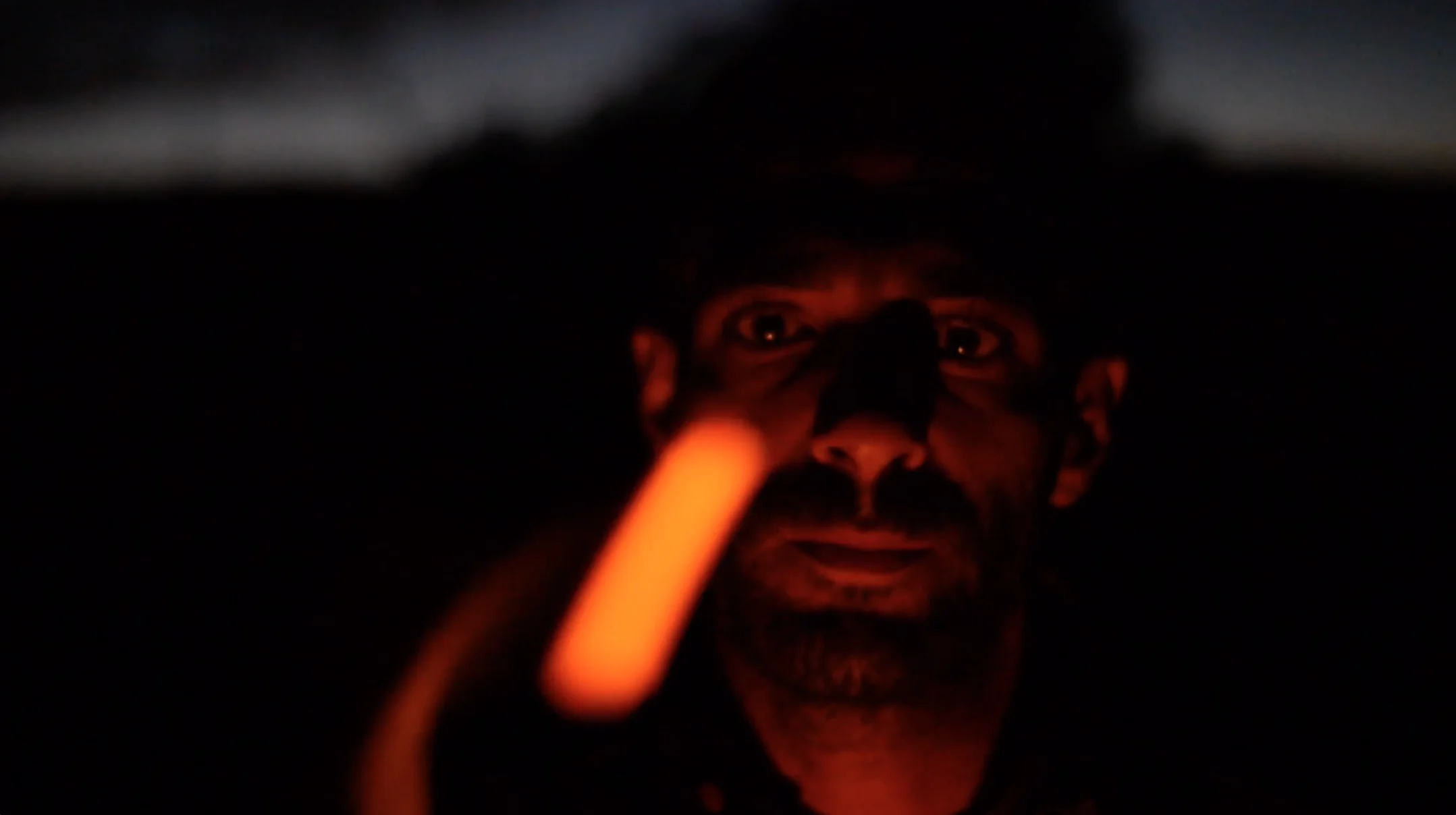
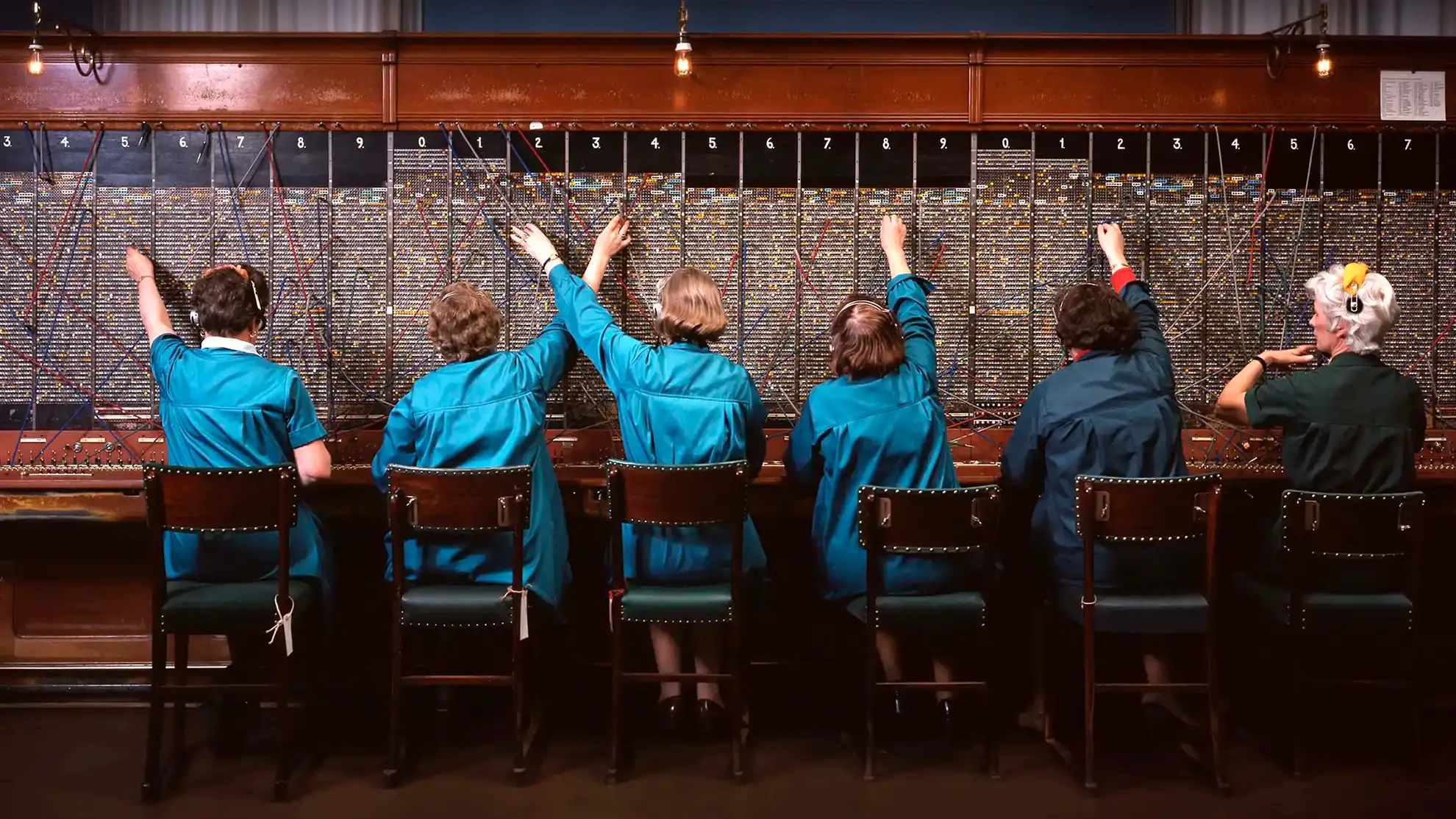
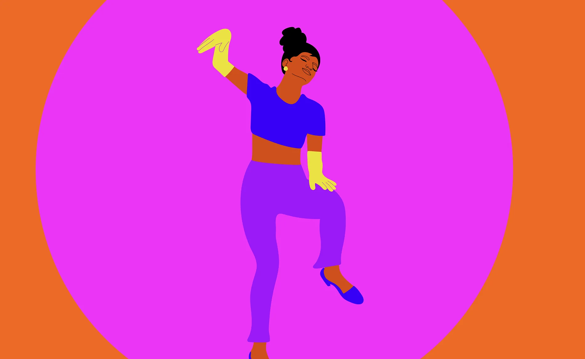
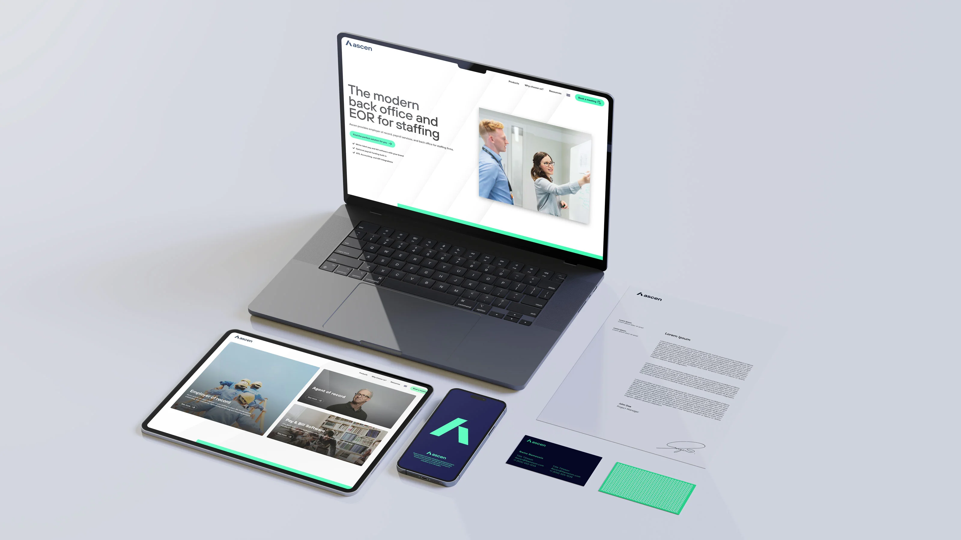
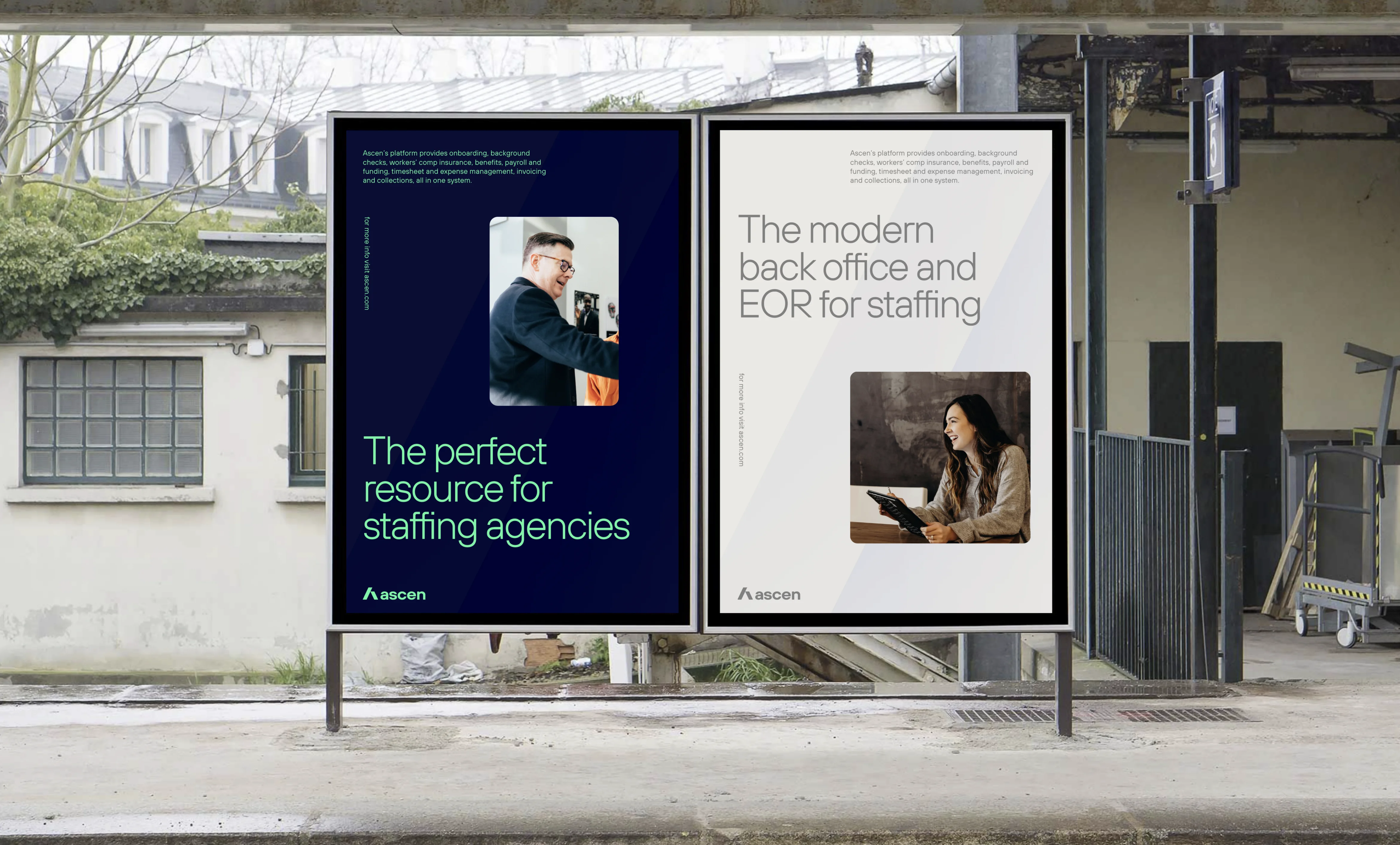
A human touch
The Ascen website serves dual purposes: it acts as both a showcase for the company's identity and a vital tool for generating leads and driving business. Our objective was clear: to craft a design that exudes simplicity and style, leaving visitors with a sense of trustworthiness and professionalism. Moreover, we sought to infuse a more human touch into the platform. Given Ascen's focus on the Human Resources industry, we aimed to incorporate more imagery featuring people. After all, it's about connecting with and catering to the individuals who stand to benefit from Ascen's services in the long run.
Curious about starting a design or digital project with Granyon? Get in touch! Rest asure we are the nice guys. No spamming or self-absorbed attitudes.
Curious about starting a design or digital project with Granyon? Get in touch! You can rest asure: we are the nice guys. No spamming or self-absorbed attitudes.